Aug 25, 2011

Dior 5 Couleurs Iridescent #609 Earth Reflection.


today i want to show you my new 5 Couleurs Iridescent palette by Dior. #609 Earth Reflection was on my wish list for a long long time since it's such a pretty neutral palette, but i never came to purchase it due to overstimulation with other cosmetic gems and of course the steep price of Dior palettes.
they contain 5 eyeshadows with a total of 6g of product and cost 53.90€ - i was lucky enough to find this in a blog sale, unused, for only 40$.
the palette comes in a velvet pouch and is the regular quint compact, a bit old-fashioned but harmoniously elaborated and of a good quality.


it's from their 5 Couleurs Iridescent line, which means it contains 5 highly shimmery colours:


  1. a shimmery golden champagne. it's rather sheer and creates a beautiful soft pearl shimmer on the lids. good as a highlight colour or also to use on its own. great to use as a cheekbone highlighter, too. i'm just a bit disappointed that it applies rather light on me, i thought it would be a medium shade.
  2. a frosty golden taupe. it's a beautiful complex colour with silver, gold and pink shimmer, remembers me of a refined version of MAC's Mauvement Pigment. it has an intense pigmentation and is very flattering as all over lid shade but dark enough to use in the crease when you opt for a soft, nude look.
  3. a frosty light beige which on me looks like an icy white. it's so light and shiny that i can only use it as highlight colour for the tearduct area.
  4. a rich cool brown. it has a silver sheen and is highly pigmented. a great shadow for a brown smokey eye since it's not too shimmery. also suited to use as crease/outer corner shade or eyeliner. it takes a bit more effort to blend out evenly. the colour looks good on my skintone.
  5. an icy pink in the center, with it's golden shimmers it applies as a pinky beige on my eyes. a very brightening shade.

Dior Earth Reflection swatched in sunlight, 1-5.

these shadows live up to what Dior is known for: they all are very fine and softly textured, they feel almost creamy to the touch and have a good colour pay-off. the darker shades are intense while the lighter ones have a glowy, pearly quality. with the iridescent shadows by Dior, you just need to remember to combine them with some less shimmery eyeshadows to not overdo it with frostiness.
the colours blend nicely and last all day on me without creasing.


tihilw

light cream in inner corner, icy pink on the lids and lower lashline, taupe in the outer corner, MAC Coffee as thick smudgy liner

gold in the inner half, taupe in the outer half, dark brown softly in the outer corner. Chanel Khaki Platine on lower lashline (review).

light gold in the inner corner and to blend up the main shadow, taupe all over the lid and on the lower lashline. Essence purple gel liner.

icy pink in the inner corner, light cream as brow highlighter, dark brown all over the lid and outer half of lower lashline. black liquid liner, MAC Coffee in lower waterline.


comparison


comparison shades:
  1. MAC Retrospeck
  2. MAC Pigment in Mauvement (LE)
  3. Artdeco Eyeshadow #12 (review)
  4. Manhattan Soft Nude palette (Party Glam LE)
  5. Guerlain L'Instant d'un Soupir (review)
  6. dark brown shade in Dior Ready To Glow palette (LE) (review)
  7. light pink in Dior Ready To Glow palette (LE)

although you see that i haven't found exact dupes to the Dior Earth Reflection palette, its neutrals are not that unique. with some of the shades i've swatched, you can definitely create the same looks as with the Dior palette. but for us cosmetic lovers it's all about the tiny differences, nuances, shimmers, right? :P


also, i've forgot to swatch the Rouge Bunny Rouge eyeshadow duo in A Major, fis Minor in comparison as these shades are some great lookalikes to the pale gold and dark brown in the Dior palette.
but here you can see some swatches of A Major, fis Minor.


Aug 23, 2011

foundation overview #14: Burberry Sheer Foundation.


the Burberry Sheer Foundation is another foundation i have tested over the last month - when the make up range was released, it didn't really attract me at a time i was all about long lasting and high coverage.
but the skin and lifestyle needs and perception have changed, and when i stumbled over another of the many praising reviews for this, i went and ordered it in Burberry's excellent online store.
they offer free delivery (which normally would be charged with 20€) for quite a while now - but i don't know for how long to come...
the shipping still is extraordinary fast, i received my order from the UK base within 3 days. packaging as always lovely and classy.


the foundation costs 43€ for 30ml.
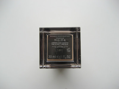
it comes in a acrylic square bottle with a chic and unusually long cap, which is of the same pewter-metallic quality like Burberry's other compacts and also has the signature Nova Check pattern engraved. the foundation pump works precisely and this time i find they have done a good job with the packaging design, sophisticated minimalism, although the haptic experience may not be as nice due to the exact edges.
ok, enough ramble from a packaging pedant. on to the product.

here what it claims to do:
  • "Burberry Luminous Fluid Foundation gives the skin a natural fresh radiance
  • The lightweight formula allows optimum light diffusion for a naturally luminous complexion
  • Fluid foundation that hydrates the skin whilst providing long lasting coverage

there is a telephone- or online-chat-consultation available where you can even send in a photo and get tele-matched. they offer 9 shades (Trench No. 01-09 - i like this numbering system).
i have bought the shade Trench No. 04, by visual judgement and untested (yes i know, but no risk no fun ;) ).
i was a bit disappointed when it arrived and i first swatched it - it seemed very light, too light for my skintone at the moment (leaning towards NC25 in MAC). it's probably a light NC20 or even a bit lighter when i just dab it on my skin.
fortunately this foundation spreads really easily and looks so natural, it looks exactly like a beautiful version of my skin without make up on. the colour blends in seamlessly and adapts to my skintone, making it only a tad bit lighter but not paler. i think it will be the perfect shade for winter times.

the consistency is rather thick and creamy and it has a pleasant but intense powdery perfume scent. i've applied it with the BeautyBlender, various brushes and with my fingers and got the same even and flawless result with both the sponges and the fluffy brushes - i remain a fan of clean fingers, though. although it's so creamy it blends surprisingly well and doesn't feel thick or greasy, however i still feel that i wear foundation. it dries to a soft, slightly creamy finish that i still like to set with powder at least on the t-zone.

it gives a light to medium coverage, but concealing all my redness and imperfections is rather achieved by how the pigments diffuse the light than how they are opaque - there still is a hint of redness peeking through my cheeks, but i don't mind that. you can build it up without it getting cakey, but it will not become high coverage.
it makes my skin appear naturally healthy without taking the dimension from it. it doesn't settle into my pores but also doesn't make them look more refined, the evenness of my skin tone just makes them less noticeable.

it wears ok on my oily skin. i start to get greasy after about 7 hours if i don't set it with powder, after that it starts to melt and fades about at the 9 hour mark.
overall this is a weird foundation to me, the finish is so lovely and flawless but it still doesn't feel completely right yet. i like it better with every time i wear it. i guess this would be a fabulous foundation for normal or dry skin types.


one drop of: Burberry Sheer Foundation in Trench No. 04 - MAC Pro Longwear in NC20
it looks really light against my skin
Burberry Sheer Foundation in Trench No. 04 right after application
Burberry Sheer Foundation in Trench No.04  10 minutes after application


tihilw

only with foundation on. isn't the finish lovely?

ingredients: AQUA (WATER) - CYCLOHEXASILOXANE - PROPYLENE GLYCOL - ETHYLHEXYL METHOXYCINNAMATE - POTASSIUM CETYL PHOSPHATE - SQUALANE - BEHENETH-30 - MYRISTYL ALCOHOL - PHENYL TRIMETHICONE - GLYCERYL ISOSTEARATE - GLYCERYL STEARATE - PHENOXYETHANOL - POLYACRYLAMIDE - CARBOMER - METHYLPARABEN - PROPYLPARABEN - CYCLOPENTASILOXANE - C13-14 ISOPARAFFIN - SODIUM HYDROXIDE - PARFUM (FRAGRANCE) - BUTYLENE GLYCOL - ALPHA-ISOMETHYL IONONE - LAURETH-7 - XANTHAN GUM - TOCOPHEROL - BENZYL BENZOATE - HYDROXYCITRONELLAL - ASCORBYL PALMITATE - BHT - ROSA ROXBURGHII FRUIT EXTRACT - [ /- (MAY CONTAIN) : CI 77019 (MICA) - CI 77891 (TITANIUM DIOXIDE) - CI 77491, CI 77492, CI 77499 (IRON OXIDES) - CI 77007 (ULTRAMARINES)]


Favicon tip and some blog features.

some weeks ago i wanted to personalize my blog a bit more. seeing some blogs appear with their own little logo/picture in the url-line of the browser and on the tabs, i was very curious and wanted this for my own blog, too - the orange B was getting boring.
i hope this helps some of you.

you may have noticed that there is this small pic/symbol on the tabs and address line when you open this blog. when you see my blog listed in a blogroll of another blogger, there is the personalized picture, too.


a favicon should help to increase your blog's recognition value and uniqueness. you should choose a symbol or picture that is representative for your blog.

this is how i did it (credits to everyone else, i just followed some tutorial).

since the favicon is so tiny, you should choose a picture that is simple and clear (i know, mine is not, but i liked the idea so so much! ;) ).  it should have a high contrast and bright colours.
i have just cut out a square part of my header picture of the Gloriosa blossom watercolour i did.


then uploaded it on a favicon generator (i used this one: http://tools.dynamicdrive.com/favicon/ , but this is also nice: http://www.favicon.cc ). you might need to downsize the photo to upload.
the generator will create a .ico file that you can download.

recently, blogger has launched an own favicon gadget, where you want to upload your .ico file and it's done!

EDIT: it seems to work with normal .png files now. just needs to be square sized and 100kb at the most. you can skip the whole favicon-generator then!


before, blogger made it real complicated to integrate an individual favicon. one had to upload the favicon to a hoster, than adding the code into the html and it still wouldn't show in blogrolls. this gadget finally makes all this possible quite easily.


furthermore, i added some small changes to the sidebar to make informations more easily accessible on the blog. i don't know what to think about it yet, somehow i find it to be a bit overloaded now. maybe i was just putting too much thought into this topic and you haven't even noticed yet lol. do you use the sidebar to navigate at all?

i need your opinion on these, please.


first thing is, i changed the label-cloud into a list. they were getting too many and too confusing. but on the other hand they take quite much scroll-space now. how would you like it better?


secondly, i've added linked pictures to informative posts of the past (like the brushes post, the brow post etc.). should i keep it? should i toss it?


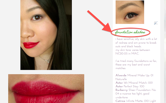
additionally i have added a list with information about my skintone and -type, most foundations i tried with the shades and how they matched. i think this might be informative for some, but is it worth being kept up in the sidebar permanently or should i just doing this as a blog post?


and lastly:

 ;D


i would love to hear your feedback.


OPI Skull & Glossbones NOTD.


this is a light greige that i like! OPI Skull & Glossbones is part of their recent Pirates of the Caribbean collection, a light warm grey cream (but not really the colour of bones). i bought it on ebay for 9.50$ (shipping included).
it contains 15ml and comes with a wide flat brush. it has a liquidy consistency and applies very easily without streaks. it dries quickly to a glossy finish and is opaque in 2 coats. i like how it looks slightly transparent and glossy (like jade or bone china) which makes the light colour not appear too light and weird on my hands. in contrast, it makes my fingers appear longer without being a nude and is different in a subtle way.
this is what i wished Deborah Lippmann's Waking Up In Vegas to be.
best part is the staying power, it stayed for 6 (!) days without chipping and visible tip wear on my nails.
one of my favourites.


NOTD


OPI Skull & Glossbones vs. Deborah Lippmann Waking Up In Vegas

OPI Skull & Glossbones - Deborah Lippmann Waking Up In Vegas

Aug 22, 2011

I'm diggin' powders! Chanel White Essentiel Brightening & Smoothing Loose Powder.


i wanted to show you another loose powder from Chanel that i recently ordered on bonboncosmetics.com. it's from their asian White Essentiel line and is called Chanel White Essentiel Brightening Translucent Loose Powder Glowing and Smoothing Effect (yeah, the asians get even longer product names than us lol).
since in asian countries the epitome of beauty is a pale, bright, flawless skin while it is the tanned, bronzey glowing skin in the occident, we don't come to enjoy this product line by Chanel.
albeit i'm not a fan of either extreme, the word "Smoothing" in the product description burnt this into my mind and as a powder-lover (check my "i'm digging powders!"-series) i had to try it :P
it's quite expensive compared to Chanel's regular loose powder, for only 10g i paid 67.99$.

the White Essentiel powder comes in a massive plastic tub similar to the the regular loose powder but with the same height like the Bronze Universel. unlike the classic range this product has a white screw top with silver logo instead of black&white.
it comes with a nice white pouf, the whole design is very clean and bright.
the powder that is inside has a pale pink colour and a beautiful, light fresh scent. it has a very fine texture, much finer than Chanel's regular loose powder.
looking close at it, you can see some shimmer bits loosely distributed in the powder, otherwise it seems completely satin-matte. but in the sunlight, you can see that it is made of ultrafine pearl particles. applied, the shimmer is not visible anymore, but it adds a soft, velvety sheen to my complexion.
the pale pink colour really creates some minimal lightening effect to my skin and the spf 15 and licorice root extract in it should help to really brighten the skin to a certain extend or at least help to prevent it getting darker.
my skin is about NC20-25 in MAC right now, the powder doesn't look chalky pale on me but becomes almost translucent on my skin.
the fine powder is really easy to apply and to spread, i only need a very small amount for my whole face. i apply it with my Lunasol Powder Brush N. it has a velvety glowing finish and doesn't emphasize on dry flakes. it doesn't set into pores or fine lines and really helps to refines the appearance of my skin, especially on my cheeks and forehead this powder works wonders!
after a few hours the powder would melt with my natural skin oils, it's not a specific mattifying powder. i don't get greasy-shiny though, rather dewy-shiny.
overall, one more excellent powder by Chanel - quite pricey but the smooth result is amazing. it really does what it promises.


note how the skin area where i blended out the powder looks smoother and a tad bit brighter than the rest.

tihilw

only foundation and brows done - with eye make up & Chanel White Essentiel powder

the light conditions were different when i took the photos. surely the Chanel powder adds some brightening effect, but it's not at all as intense as the colour difference on the pictures. you can sense the velvety soft finish, though.


Related Posts Plugin for WordPress, Blogger...